Starchitect Power!!!
Towards the end of today I was feeling more than a bit feverish, the culminative effect of sleeping for two hours a day for a week. More cowbells won't help now, sleep would. Nonetheless to celebrate the end of a tough week I went for sushi and succeeded in not letting my face fall in the food. Afterwards I stumbled south to catch the Frank Gehry retrospective at the AGO. Bad idea perhaps, but this is what I call mental opium: I can never get tired of standing in front of magnificent buildings and letting my napoleonic alter ego pretend that I designed it.
I can't say that I'm a big Frank Gehry fan; I've always been queasy with the whole nihilistic undertone of deconstructivist buildings. But man, anything is preferrable to the sad pathetic excuse of an art museum that is the current AGO. The fact that I was one of the only two people there speaks volumes.
The AGO kindly designated what felt like its storage room to this meagre exhibit of 5 buildings. Adding salt to injury, visitors had to pass through that dreadful concrete walkway with the dreadful picture of that dreadful Henry Moore sculpture, past that dreadful sculpture court, where, even more dreadfully, two women sat gazing at the Henry Moore's, full of admiration ("Is that a phallic object?")
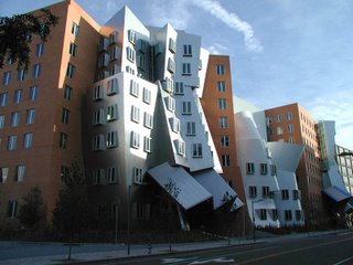
On display was the Stata Center (pictured above) at the MIT. I thought I rather liked it compared to the other Gehry projects: playful, packs a punch, but not too destructive. The building meets the sidewalk more or less like a normal mid-rise does, and the overall form is just conventional enough to blend in with the street wall. There's even an amphitheatre-like entrance that is apparently intended for students to loiter and people-watch--a small concession to the common man that many demigods of architecture nowadays refuse to make. All in all, a "comfortable" building for where it is.
Interestingly Gehry had based the whole building's concept on an Orangutan's village, because many professors expressed the desire to have a building with a "hierachy" built into it. The laws of the jungle still rule. Chuckle.
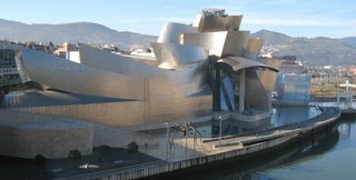
I never really liked his signature stuff though. You know what with all the titanium and wood. Irrational, bewildering for no good reason; plus the sensitivity to context is pretty much none-existent here. Looking closely and you'll see that his Walt Disney concert hall in downtown LA is built entirely upon a foundation of a concrete platform. How is that a friendly gesture to pedestrians who can only see a blank wall as they walk down the street? Downtown L.A. is not the most lively place to start with; that building just about puts the last nail in the coffin as far as the immediate surroundings are concerned.
Fuck, he's Frank Gehry. Starchitects like him get to make expensive personal states like that.
In the last room was Transformation AGO. I honestly thought he wasn't really trying with that building (did anyone else feel that way?). An improvement no less; plus the art gallery can always do with a bigger over-priced gallery shop.
As I stepped out of the exhibit they were showing a video clip with Adrienne Clarkson interviewing Gehry for the CBC, where he kept bitching about the poor-Jewish-little-me. Yeah, his name was originally Ephraim Goldberg.
The entire exhibit took me half an hour. Don't spend 10 bucks on this thing unless you have a membership. Wikipedia puts together a better Gehry retrospective than the AGO does.
I walked up Spadina towards my apartment in the early March dampness, face burning, feeling slightly unsteady because of the fever while trying to balance the hang-over-in-a-bottle cheap wine I had just bought. As I rounded Spadina Circle I secretly wished that Toronto had been a more beautiful place.
1 comment:
how entertaining
!
Post a Comment